
Blank walls can make even a beautifully furnished room feel unfinished. A gallery wall is the fix: a curated arrangement of frames, art, photos, and sometimes mirrors that turns empty wall space into a personal, eye-catching display. Done well, it tells your story, anchors your furniture, and gives a room the layered, collected feel that makes a house look like a home.
The best part? Gallery walls work in just about every room and every budget. Whether you are hanging a symmetrical grid of matching prints or a wild salon-style mix of vintage finds, the same principles apply: a clear layout, consistent spacing, and a color story that ties it all together. This guide walks you through 21 gallery wall ideas for living rooms, bedrooms, hallways, staircases, and more, with practical hanging tips and US-ready guidance on sizes, spacing, and hardware.
1. The Symmetrical Grid
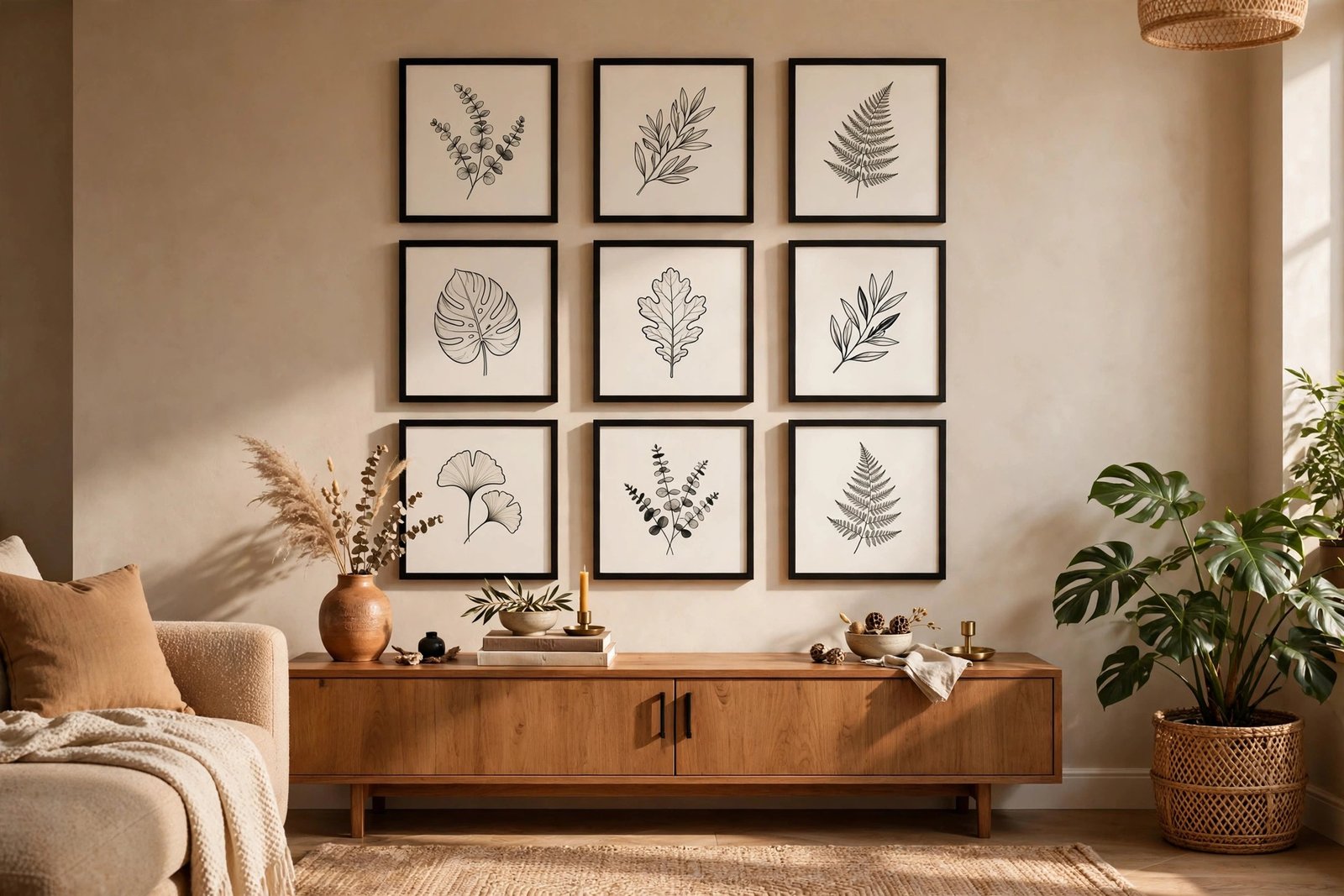
The grid is the safest gallery wall idea for beginners, and it looks sharp in almost any room. Use matching frames in a single color, usually black, white, or natural wood, and hang them in an even grid, such as 3 rows of 3. Keep the gap between frames consistent, about 2 to 3 inches, and measure from a center point outward so the whole arrangement stays balanced.
This layout works especially well above a sofa, a console table, or a desk, where its tidy structure complements the furniture below it. For a clean museum look, print all your art at the same size, 11×14 or 12×12 inches are popular. If your frames come from a big-box store, buy one extra to test your layout on the floor first. The grid is also ideal for minimalist home decor lovers who want art on the wall without visual clutter.
Pro tip: hang the center frame first using a level, then work outward row by row. Step back every few frames to check alignment from across the room, small shifts look bigger from a distance than they do up close.
2. The Salon-Style Mix
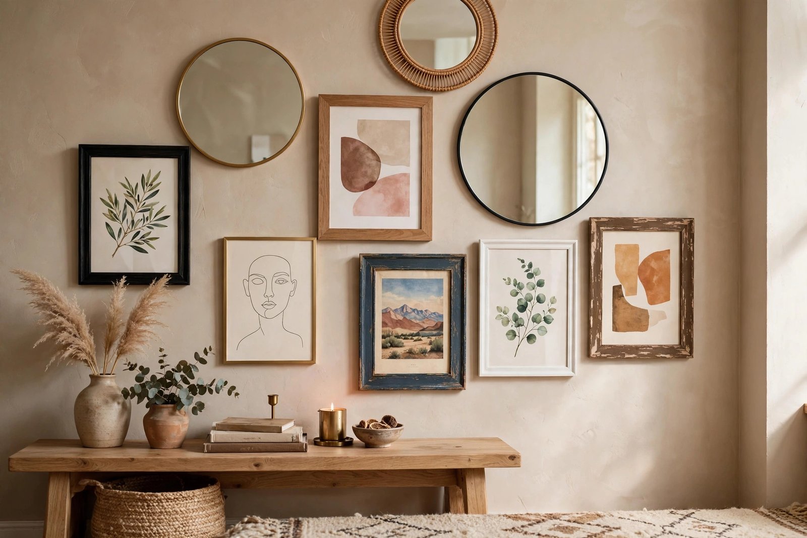
The salon wall is the opposite of the grid: an eclectic, floor-to-nearly-ceiling mix of frames in different sizes, finishes, and styles. It comes from the way old European salons displayed paintings packed tightly together, and it brings instant character to a room. Start with your largest piece slightly off-center, then build outward, keeping gaps between 2 and 4 inches.
To keep a busy mix from looking chaotic, repeat something throughout: a color, a frame finish, or a subject type. Black frames with white mats are the classic unifier. A salon wall is perfect for collectors who have pieces gathered over time, from thrifted landscapes to kids’ artwork. Hang it in a living room or reading nook where people can stand close and browse the details.
Pro tip: leave the salon wall slightly imperfect. A little asymmetry is the charm of this style, so do not measure every gap with a ruler. Just keep the overall shape roughly rectangular and let the mix breathe.
3. Gallery Wall Above the Sofa
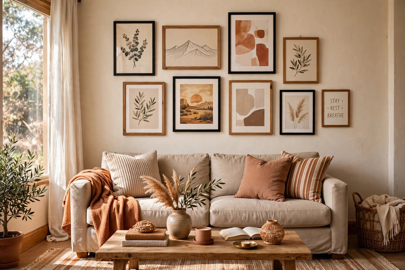
The wall above the sofa is the most popular gallery wall location in American homes, and the rules are simple. Center the arrangement over the sofa, keep the bottom of the frames 6 to 8 inches above the sofa back, and make the overall display about two-thirds the width of the sofa. Going too small is the most common mistake here.
A loose grouping of five to seven frames works beautifully above a standard sofa. If your sofa is a large sectional, try a horizontal arrangement that follows its line. Before hammering nails, trace each frame on kraft paper, tape the paper shapes to the wall, and live with them for a day. This one trick prevents most gallery wall regrets, and it costs nothing.
Pro tip: if your sofa sits against a large open wall, let the gallery extend a little wider than two-thirds, up to the full sofa width. On tall walls, a second smaller row above the main row fills vertical space nicely.
4. Staircase Gallery Wall
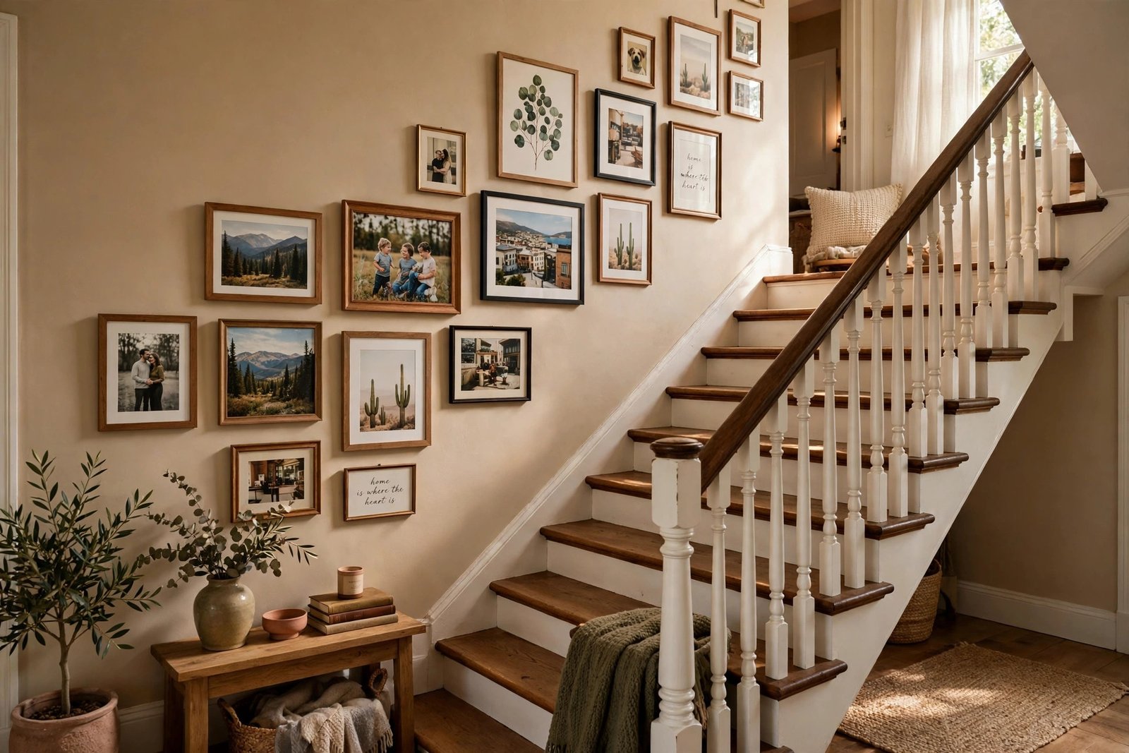
Staircases have long, underused walls that are made for gallery displays. The trick is to keep the bottom edge of the frames following the angle of the stairs, roughly 6 to 8 inches above each step’s nose, so the arrangement climbs naturally with the staircase. Start at the bottom and work your way up.
Staircase walls are perfect for family photo timelines, chronological travel prints, or a series of matching art prints. Because you view these from below and above, choose pieces with strong shapes that read well from a distance. Secure heavier frames with two hangers and consider LED strip lighting along the stair stringer if the area is dim.
Pro tip: photograph your staircase wall from the landing above as you go. A photo flattens the perspective and reveals crooked frames and awkward gaps that are hard to see while you are standing on the stairs.
5. The Oversized Anchor Piece
You do not always need many frames. One large art print or canvas, at least 24×36 inches, can anchor an entire gallery wall on its own. Hang the big piece first, centered at eye level, then add two to four smaller frames around it if the wall still feels bare. This approach suits smaller rooms where a crowded grid would feel busy.
Oversized pieces also solve the renter dilemma: one nail or one heavy-duty hanging strip instead of ten. Look for large-format prints of landscapes, abstracts, or architectural photography, they read well from across the room. Give the anchor piece generous breathing room on all sides so it reads as intentional, not accidental.
Pro tip: choose an anchor piece with at least one color pulled from your rug or throw pillows. That one shared color is what makes a single large print feel connected to the rest of the room.
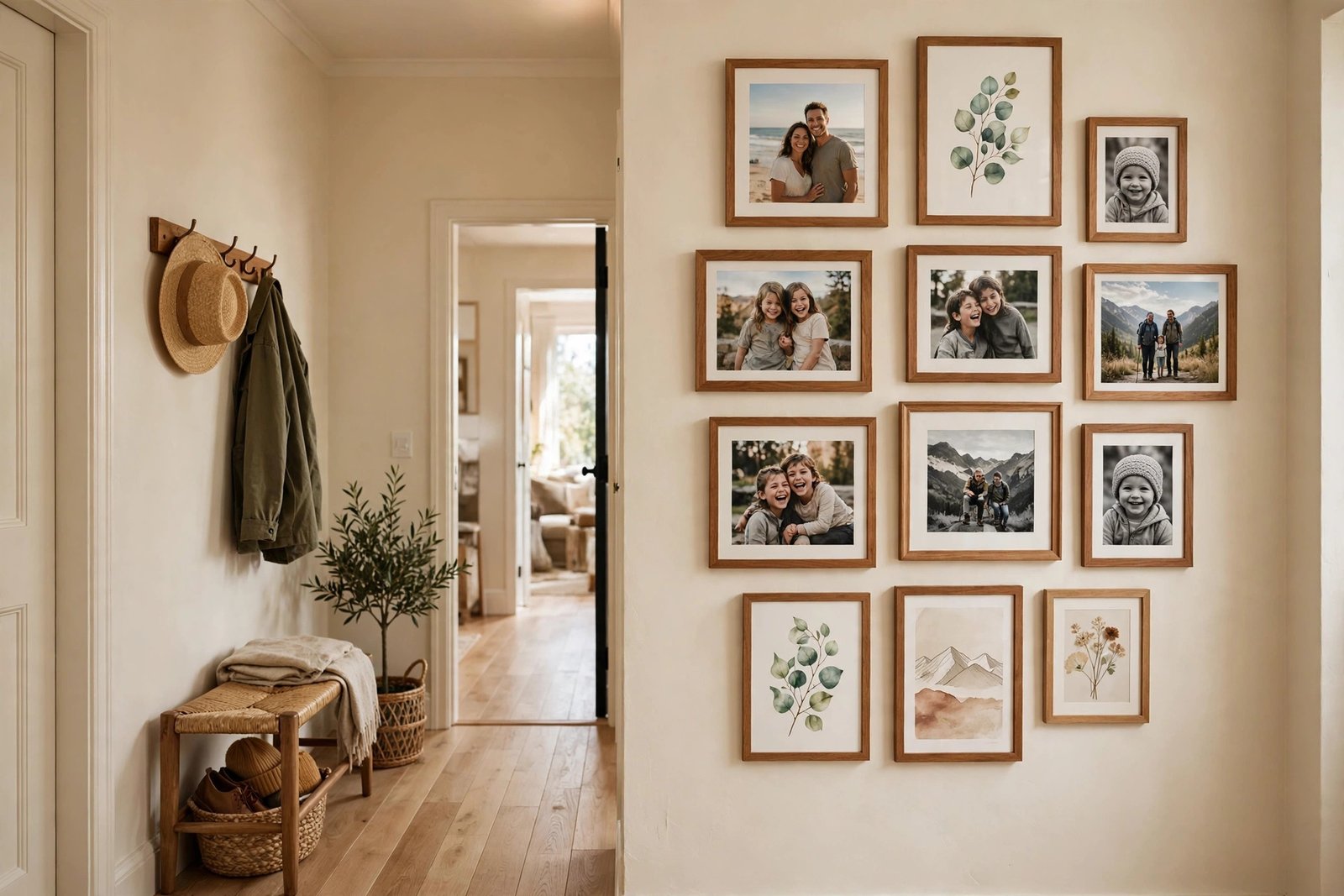
6. The Hallway Gallery Wall
Narrow hallways are gallery wall gold. Since people pass through quickly, choose images that read well in a glance: family photos, travel prints, or a series with a clear theme. Keep frames in a single horizontal line at eye level or in two tidy rows, and leave enough wall width so the hallway still feels open.
In tight corridors, keep frames relatively small, 8×10 and 11×14 work well, and use lighter frame finishes so the space does not feel heavy. A hallway gallery can also double as a family timeline, adding one frame per year. Because hallways rarely have windows, picture-frame safe lighting or a couple of warm sconces make a big difference after dark.
Pro tip: number your frames on the back and mark matching spots on the wall with painter’s tape before hanging. In a narrow hallway you cannot easily step back, so a numbered plan saves a lot of trial and error.
7. Mirrors Mixed With Art
Adding mirrors to a gallery wall breaks up the rectangles and bounces light around the room, making small or dark rooms feel larger. Mix one or two mirrors among your frames: round mirrors soften angular frame layouts, while arched or irregular shapes add interest. Place mirrors where they will reflect something pretty, like a window or a plant.
Keep the total mirror count low so the wall still reads as art, not as a mirror collection. Brass or rattan mirror frames warm up a gallery that is mostly black-and-white prints. This idea is especially effective in entryways and living rooms that could use more brightness.
Pro tip: check what each mirror reflects before you finalize placement. A mirror facing a blank ceiling wastes its potential, while one catching a window doubles your daylight and makes the whole wall glow.
8. The Corner Wrap
Do not let a corner stop your gallery wall. Wrapping frames around two adjoining walls creates a custom, designer feel and works beautifully in reading corners, offices, and bedrooms. Keep the spacing tight near the corner so the two sides read as one continuous arrangement, and continue your color story around the bend.
Plan this layout on paper first, since corners make measuring trickier. A good approach is to build each wall’s section as a mirror of the other. Corner-wrap galleries look intentional rather than accidental when the frames on both sides sit at the same height range.
Pro tip: in a corner wrap, keep at least one frame within a few inches of the corner on each side. That tight bridge is what makes the two walls read as one arrangement instead of two separate displays.
9. Picture Ledge Layers
Picture ledges, narrow shelves that hold leaning frames, are the no-commitment gallery wall. You can rest framed prints, small canvases, and even books on them, layering pieces in front of one another for depth. When you want a change, you just slide frames around, no new holes required.
Install two or three ledges staggered at different heights, or one long ledge spanning the wall. Overlap frames generously and vary heights so the display feels curated, not flat. Ledges are also a renter favorite, since one shelf installation replaces a dozen nail holes. Style them with a mix of art, small plants, and a candle for a lived-in look.
Pro tip: use museum putty or small adhesive dots on the back corners of leaning frames. It keeps them from sliding on the ledge when doors slam or kids run past, with no visible hardware.
10. The Color Story Wall
Pick a color palette and let it guide every piece: warm neutrals with terracotta and ochre, for example, or blues and greens with natural linen tones. When all the art shares a color story, you can mix photography, abstracts, and illustrations freely, and the wall still feels cohesive. This is the secret behind those Pinterest-perfect galleries.
Start by pulling three to five colors from your existing room decor, then choose or mat your art to match. You can even re-mat thrifted prints in new mats to force them into your palette. A color story wall ties your gallery directly into the room, so it feels like a planned part of the decor rather than an afterthought.
Pro tip: if you are struggling to match colors, build the palette around your three favorite pieces and re-mat the rest. New mats are cheap and they can pull wildly different prints into one cohesive story.
11. Family Photo Timeline
Few things warm up a home like a gallery wall of family photos. A timeline arrangement, wedding photos leading to baby photos to recent vacations, tells your family’s story in a way guests genuinely stop to look at. Use matching frames to keep the display tidy, and print in a consistent size for a polished result.
Print photos at a real lab or use a reputable online print service for sharp, true-color results, home inkjet prints fade faster. Staircase and hallway walls are classic spots, but a dining room family wall adds warmth where people gather. Add a small brass plaque or handwritten label under key photos for a heritage feel.
Pro tip: scan and back up your family photos digitally before printing. A single hard drive failure should never wipe out the originals behind your gallery wall, and backups make reprints painless.
12. Gallery Wall Above the Bed
The wall above the headboard is prime gallery space in a bedroom. Keep the arrangement low enough to feel connected to the bed, about 4 to 6 inches above the headboard, and about two-thirds the bed’s width. Two or three larger pieces often work better here than many small ones, since bedrooms should feel calm.
Choose soothing subjects: soft abstracts, botanical prints, or muted photography. Secure frames well, especially anything above where you sleep, using wall anchors or museum-grade hanging strips rated for the frame’s weight. For extra cozy bedrooms, a symmetrical pair of matching prints flanking a centered piece looks effortlessly balanced.
Pro tip: in a bedroom, skip anything with harsh contrast or busy subjects above the bed. Soft, low-saturation art supports the calm feeling you want where you sleep, even if your living room gallery is bold.
13. Dining Room Gallery Wall
Dining rooms deserve gallery walls too. A food-themed collection, vintage market posters, still-life prints, or warm landscape photography, makes the room feel like a proper dining destination. Hang pieces so the center sits at seated eye level, slightly lower than a living room gallery.
Because dining rooms host evening meals, consider lighting: a picture light or two warm sconces above the arrangement makes the art glow after dark. Darker frame finishes like espresso or aged brass suit the moodier feel of many dining rooms. If you entertain often, a gallery wall of travel photos from food trips becomes a great conversation starter.
Pro tip: keep glass-fronted frames a few inches back from candle centerpieces. Soot can film over glass surprisingly fast, and matte-finish prints hide dining-room wear better than glossy ones.
14. Kitchen Gallery Wall
Kitchens can host gallery walls, just choose the right spot. The wall by a breakfast nook, an empty stretch near the entry, or the space above a coffee station works well. Avoid placing art directly above the stove, where grease and steam will damage it, and keep frames away from the sink’s splash zone.
Kitchen-friendly art includes vintage recipe illustrations, herb botanicals, food photography, and small framed chalkboard-style quotes. Use frames with glass fronts so you can wipe them clean, and simple metal or sealed wood frames that resist humidity. A small three-piece cluster above a coffee bar looks charming without overwhelming the workspace.
Pro tip: if your kitchen has an awkward blank wall near the pantry, that is your gallery spot. It is out of the grease zone but still in the heart of the room, and three small frames are usually all it needs.
15. Entryway Gallery Wall
Your entryway sets the tone for the whole house, and a small gallery wall makes it feel welcoming from the first step inside. A row of three to five frames above a console table or bench is all it takes. Combine a mirror for last-minute checks with art that reflects your style.
Keep entryway galleries slim and secure, since bags and coats brush past them. Slim-profile frames with safety glass are a smart choice. A small tray on the console for keys below the frames completes the vignette and keeps the whole entry organized.
Pro tip: a console table with closed storage below your entryway gallery hides shoes and clutter, so the art stays the star. One pretty basket inside the cabinet keeps the everyday mess out of sight.
16. Gallery Wall Above the Fireplace
The mantel wall is a natural focal point, and a gallery arrangement above it draws the eye up and adds warmth. Lean one large piece on the mantel itself, then hang two or three smaller pieces above it, or hang a tight cluster centered over the mantel. Keep the lowest frames high enough that heat and soot will not damage them.
Layered mantel galleries with leaning frames are easy to restyle seasonally, just swap pieces in and out. Pair your art with garlands or candles on the mantel for a styled look. If your living room leans whimsical, mix storybook-style illustrations into the cluster for a playful twist, like the playful character seen in whimsical fairytale living room ideas.
Pro tip: lean your largest frame on the mantel instead of hanging it. Leaning makes seasonal swaps easy and avoids drilling into brick or stone, which is one of the hardest surfaces to patch later.
17. Kids’ Art Gallery Wall
Turn children’s artwork into a real gallery and watch their confidence grow. Dedicate a hallway, playroom wall, or the side of a staircase to rotating kids’ art, using clip frames, binder-clip strings, or simple frames with easy-swap backs. Hanging it with the same care you would give adult art teaches kids their creativity matters.
Let kids choose which pieces go up and help hang them at their eye level where possible. A themed wall, all animals or all rainbow drawings, looks surprisingly polished. Swap pieces every month or two and store favorites in a portfolio box so the collection does not take over the house.
Pro tip: date the back of each piece with a pencil when you hang it. Years later you will love knowing exactly when your six-year-old drew that surprisingly good dinosaur.
18. Black-and-White Photo Wall
Converting photos to black and white is the fastest way to make a mismatched collection look intentional. Family photos, travel snapshots, and architectural shots all unify beautifully in monochrome. Pair them with black frames and white mats for a timeless look that works in traditional and modern homes alike.
Most print services offer a black-and-white filter at checkout, or batch-convert in a free photo editor before uploading. A black-and-white gallery suits hallways, home offices, and living rooms where you want personality without color competition. Add one sepia or warm-toned print as an accent if pure monochrome feels too stark.
Pro tip: mix photo orientations within the monochrome wall, some portrait, some landscape. The consistent black-and-white treatment unifies them, while varied orientations keep the display from feeling repetitive.
19. Gallery Wall With Picture Lights
Lighting transforms a gallery wall from daytime decor to evening showpiece. Battery-operated picture lights mount directly on frames or the wall with no wiring, while plug-in sconces above the arrangement give a classic gallery glow. Warm 2700K bulbs keep the light flattering rather than clinical.
Light the wall you actually look at in the evening: the living room gallery gets priority over the hallway. For a polished effect, aim each light to wash evenly across its frames rather than spotlighting one piece. If you love layered lighting in general, this is a natural extension of well-planned stylish living room decor ideas, where lighting does half the decorating work.
Pro tip: plug-in picture lights with a cord cover painted to match the wall look nearly as clean as hardwired ones, at a fraction of the cost. Run the cover straight down behind a console table to hide it completely.
20. Seasonal Rotating Gallery Wall
Instead of a permanent arrangement, dedicate one wall or a set of clip frames to the season. Swap in autumn landscapes for fall, snowy scenes for winter, florals for spring, and coastal prints for summer. It keeps your decor feeling fresh with minimal effort, and it gives you an excuse to hunt for new art year-round.
Use frames with front-loading or easy-open backs so swaps take minutes, or lean seasonal prints on picture ledges. Store off-season prints flat in an archival box to keep them crisp. A seasonal gallery wall is especially fun above a mantel or in an entryway where guests will notice the change.
Pro tip: keep a small storage box labeled by season right in the room where the gallery hangs. If swapping prints takes more than ten minutes, you will stop doing it, and the wall will never change.
21. The Renter-Friendly No-Hole Wall
Renters can have gallery walls too. Adhesive hanging strips rated for the right weight hold most small and medium frames damage-free, and many landlords explicitly allow them. For heavier pieces, lean large frames on a dresser, console, or mantel, or rest them on a picture ledge that needs only two screws.
The floor-lean, a large frame propped against the wall, is the ultimate commitment-free gallery move and looks intentionally casual in boho and modern spaces. Modern living rooms in small houses benefit especially from lean-to displays, since they add art without closing in the room. Always check your lease before hanging, and test one strip behind furniture first to make sure it removes cleanly from your wall paint.
Pro tip: adhesive strips fail most often on textured or freshly painted walls. Press each strip firmly for a full thirty seconds, wait the hour the package recommends before hanging, and your frames will stay put.
Products to Consider
You do not need much to build a great gallery wall, but a few basics make the job far easier and the result far better:
- Matching picture frame sets in a single finish for grids and timelines
- Mixed-size frame bundles for salon-style arrangements
- Picture ledges for leaning and layering frames
- Adhesive picture hanging strips for damage-free hanging
- Small round or arched mirrors to mix in with art
- Battery-operated picture lights for evening glow
- Kraft paper or painter’s tape for planning layouts on the wall
- Archival photo prints for sharp, long-lasting family photos
Frequently Asked Questions
How do I choose a layout for my gallery wall?
Start with your wall and furniture. Symmetrical grids suit structured rooms and matching frames, while salon-style mixes suit eclectic collections and larger walls. Trace your frames on kraft paper and tape the shapes to the wall to test any layout before you hang. If you are unsure, a centered grid or a simple horizontal row is always safe.
How far apart should gallery wall frames be?
Most designers recommend 2 to 3 inches between frames for a cohesive look, up to 4 inches for larger walls and bigger frames. Consistency matters more than the exact number: pick one spacing and keep it uniform across the arrangement. Measure from frame edges, not from centers.
How high should a gallery wall hang?
The center of the overall arrangement should sit at roughly eye level, about 57 to 60 inches from the floor. Over furniture, leave 6 to 8 inches between the furniture top and the bottom of the lowest frame. Above a sofa or bed, the arrangement should span about two-thirds of the furniture’s width.
Can I hang a gallery wall without damaging the walls?
Yes. Adhesive hanging strips hold most small to medium frames and remove cleanly when used as directed. Picture ledges need only one or two screws and display many frames at once. For heavy pieces, lean them on furniture or the floor. Always use strips rated for your frame’s weight and test on an inconspicuous spot first.
What frames work best for a gallery wall?
It depends on your style. Matching black frames with white mats are the most versatile and forgiving choice. Natural wood frames warm up neutral rooms, while mixed vintage frames suit eclectic and boho spaces. Whatever you choose, repeat at least one element, color, finish, or mat style, throughout the arrangement so it reads as one display.
Final Thoughts
A gallery wall is one of the highest-impact, lowest-cost upgrades you can make to a room. Start with art you already own, plan your layout on the wall with paper templates, and hang with consistent spacing. Whether you choose a crisp symmetrical grid, a packed salon wall, or a damage-free renter arrangement, the same ingredients, a clear layout, a color story, and a little patience, will give you a wall that feels personal and polished. Pick one of these 21 ideas, gather your frames this weekend, and give your blank walls the attention they deserve.